
Extreme value theory III
Published:
In previous entries (here and here we introduced and discussed the basic elements of Extreme Value Theory (EVT), such as the extreme value distributions, the generalized extreme value distribution, saw examples of such distribution, as well as simulated data and their corresponding fits. In this entry we get our hands on real data and see how we can make some inference using EVT. In particular, we focus on Maximum Likelihood methods for parameter estimation of a temperature dataset from my home city, Santiago de Chile.
If you like my content, consider following my linkedIn page to stay updated.
Estimating the parameters of the GEV
Recall the setting from our previous entries: consider an i.i.d. process ${ X_n }$ with distribution function $F$ and define $M_n:= \max\{X_1,\dots,X_n \}$. The extremal types theorem says that if there are constants $a_n,b_n$ and a non-degenerate distribution $G$ such that
\[\dfrac{M_n - b_n}{a_n} \Rightarrow G,\]then $G$ is the generalized extreme value distribution, which has the form
\[G(z) = \exp \left\{-\left[1+\xi\left(\frac{z-\mu}{\sigma}\right)\right]^{-1 / \xi}\right\}\]for parameters $\mu \in \mathbb{R}$, $\sigma > 0$, $\xi \in \mathbb{R}$ and $z \in \{z: 1+\xi(z-\mu) / \sigma>0\}$. We have see that the possible types (arising from the choices $\xi > 0$, $\xi = 0$ and $\xi < 0$) present different qualitative properties, such as the bounds on their supports or how heavy their tails are. It is important then to be able to make inference about the parameters $\mu,\sigma,\xi$ when we are presented data.
Suppose that we are given observations $m_1,\dots,m_n$ following a GEV $G(\mu,\sigma,\xi)$. All the following equations hold under the assumption that $z$ is in the correct region. The density of the GEV is given by
\[\dfrac{d}{dz}G(z) = \dfrac{1}{\sigma}\exp\left(-\left[1+\xi\left(\dfrac{z-\mu}{\sigma}\right)\right]^{-1/\xi} \right)\left( 1+\xi\left(\dfrac{z-\mu}{\sigma}\right)\right)^{-1/\xi -1},\]from which it follows that the likelihood of this set of observations is
\[L(m_1,\dots,m_n| \mu,\sigma,\xi) = \prod_{k=1}^n \dfrac{1}{\sigma}\exp\left(-\left[1+\xi\left(\dfrac{m_k-\mu}{\sigma}\right)\right]^{-1/\xi} \right)\left( 1+\xi\left(\dfrac{m_k-\mu}{\sigma}\right)\right)^{-1/\xi -1}.\]for the $\xi \neq 0$ case. Taking the logarithm of both sides, we obtain that the log-likelihood is then
\[\ell(m_1,\dots,m_n| \mu,\sigma,\xi) = -n\log\sigma - (1+1/\xi)\sum_{k=1}^n \log\left[ 1 + \xi\left(\dfrac{m_k-\mu}{\sigma}\right) \right] - \sum_{k=1}^n\left[1 + \xi\left(\dfrac{m_k - \mu}{\sigma} \right) \right]^{-1/\xi}.\]Similarly, for the $\xi = 0$ case we obtain the log-likelihood
\[\ell(m_1,\dots,m_n| \mu,\sigma,\xi = 0) = -n\log\sigma - \sum_{k=1}^n \left( \dfrac{m_k - \mu}{\sigma} \right) - \sum_{k=1}^n \exp\left[ -\left(\dfrac{m_k-\mu}{\sigma} \right)\right] .\]We find then the parameters that maximize $\ell$, normally by means of optimization libraries such as scipy, or libraries that can directly find the optimal parameters for us, such as optimize from scipy.
Hands-on data
Now we will apply all we have seen to a data set consisting of measurements of the temperature at the Quinta Normal weather station in Santiago de Chile. The data was obtained here.
df = pd.read_csv("../input/330020_XXXX_Temperatura_.csv", sep = ';' ,parse_dates = True)
The data set consists of a table with three columns, CodigoNacional, corresponding to the station code, having the same value for all rows, momento, corresponding to the time and date of the measurement, and Ts_valor, corresponding to the temperature measurement in Celcius. We will disregard the first column as it has no valuable information when we are dealing with only one station, and rename the other columns to date and temp.
df = df.drop(columns = 'CodigoNacional')
df.columns = ['date','temp']
The number of observations is 140091 and it ranges from 01-03-1967 to 30-11-2019. There are 122 missing values in the temp column, to which we will assign the mean value of the column.
np.sum(df.isnull(), axis = 0)
df['temp'] = df['temp'].fillna(df['temp'].mean())
We can plot now the time series to have a look at it.
plt.plot(df['temp'])
plt.title("Time series of temperatures")
plt.show()
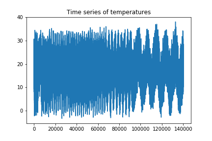
We can see that the series looks more compressed towards the first part of it. This might be due to an issue of the frequency of sampling changes. For our purposes, this will not be a problem, as we will not need all the samples of the time series.
df = df.set_index('date')
We will now make the column date the index of the dataframe, making it easier to handle it.
df = df.set_index('date')
df.index = pd.to_datetime(df.index)
df = df.sort_index()
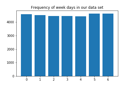
With this we can make some quick checks:
days_freq = []
for i in range(1,8):
    days_freq.append(np.sum(df.index.day == i))
    print(days_freq[i-1])

plt.bar(range(7),days_freq)
plt.title("Frequency of week days in our data set")
plt.show()
Now we create a new time series consisting of the maximum temperature observed each day:
df_max = df.groupby([df.index.date]).max()

plt.plot(df_max['temp'])
plt.title("Time series of maxima")
plt.show()
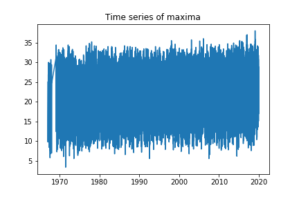
We can see that it does not look compressed anymore. We can also see that there is a section missing at the start of the time series, so we will consider observations starting from 1970 onwards. We will also only consider maxima corresponding to the summer season, that is, between 22nd of December and 21st of March (we omit Dec 21st for rounding reasons but this is not relevant).
We will consider blocks of length equal to ten days, and for each them, we will consider its respective maximum. Thus, in a 90 days summer, we will obtain 9 different observations. Now, some important observations:
- We will assume that the observations are independent.
While there are tests to check if this is actually plausible, we will not focus on it for now.
- We will also assume that the data is stationary.
Again, there are corresponding tests for this, but we will assume this is true, fit the model and then evaluate it. We construct now the block maxima:
block_max = []

for i in range(1970,2018):
    startdate = pd.to_datetime(str(i) +"-12-22").date()
    enddate = pd.to_datetime(str(i+1)+"-3-21").date()
    summer = df.loc[startdate:enddate]

    for j in range(9):
        block_max.append(summer[j*10:(j+1)*10].max(axis = 0).values[0])

block_max = np.array(block_max)
Let us see the corresponding time series of the block maxima:
plt.plot(block_max)
plt.title("Time series of block maxima")
plt.show()
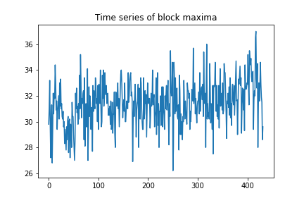
More interesting than the time series itself is a histogram of it, as we can see the distribution
plt.hist(block_max)
plt.title("Histogram of block maxima")
plt.show()
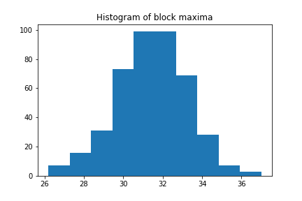
Looks quite familiar, right? Let us see if we can fit a GEV distribution to it:
from scipy.stats import genextreme as gev

shape, loc, scale = gev.fit(block_max)

x = np.linspace(20, 50, num=100)
y = gev.pdf(x, shape, loc, scale)

plt.hist(block_max, density = True , alpha=.3 ,bins = 10)
plt.plot(x, y, 'r-')
plt.title("Histogram with fitted GEV")
plt.show()
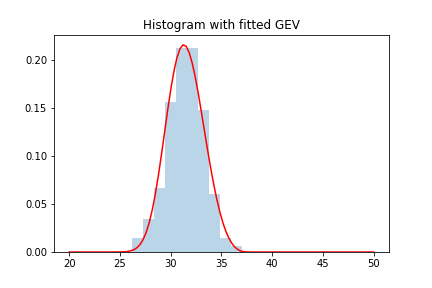
Remark: while in the first section we introduced ML methods to estimate parameters of the GEV, there are other methods for doing it so that might yield better/faster results. I will not go into the details of how scipy is doing this, but one can always check the documentation/source code if interested.
We can see how we obtained a pretty good fit. We can see what the parameters of the fit are:
print(shape,loc,scale)
> 0.255993226608202 30.786910300677764 1.7675333367793673
In particular we can see that the shape parameter is positive, and hence we are dealing with a type 2 or Frechet distribution.
Word of caution: the form of the density/CDF of the GEV distribution that scipy uses is slightly different to the one we are using, so the exact value of the parameters will not be of great importance for us now.
In order to have a better idea of how good the fit is, we can use both P-P and Q-Q plots. We recall their construction for the sake of completeness:
For a P-P plot, suppose our observations $M_1,\dots,M_n$ with estimated distribution $\hat G$ are ordered increasingly $M_{(1)}\leq \dots \leq M_{(n)}$. If we plot the points
\[\left( \hat G(M_{(k)}) , \dfrac{k}{n+1} \right)\]for $k = 1,\dots,n$. If our estimate $\hat G$ is reasonable, then the plot described has the following property: for any such $k$, we have that there are $k$ observations with size less or equal than $M_{(k)}$. This means that the emperical estimate of the probability $\mathbb{P}(M\leq M_{(k)}) = G(M_{(k)})$ is given by $\frac{k}{n}$. In practice, we will use $\frac{k}{n+1}$ as we do not necessarily want the support of our distribution to be bounded (i.e., $\mathbb{P}(M\leq M_{(n)}) = 1$). Thus if our model is reasonable, the points $\left( \hat G(M_{(k)}) , \frac{k}{n+1} \right)$ should lay close to the diagonal.
Let us check with our data:
x = np.array(block_max)
y = scipy.stats.genextreme(loc = loc, scale = scale ,c = shape).rvs(len(block_max))
pp_x = sm.ProbPlot(x, fit=True)
pp_y = sm.ProbPlot(y, fit=True)

fig = pp_y.ppplot(line='45', other=pp_x,alpha = 0.3, marker='.')
plt.title('P-P plot of our empirical data vs fitted distribution')
plt.show()
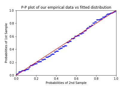
As remarked in Coles’ book, it is worth pointing out one weakness of the P-P plot in the context of EVT: since we are plotting probabilities (empirical and predicted), at the right end of the plot the points will inevitably get closer together. This represents a difficulty when we are interested in the goodness of the fit around the extremes of the distribution.
The Q-Q plot is similar, only that we apply $\hat G$ to both coordinates, hence we plot the set of points
\[\left(M_{(k)}, \hat G^{-1}\left( \dfrac{k}{n+1} \right) \right)\]for $k = 1,\dots, n$ (remark: in some sources the plot is flipped with respect to $y = x$). While this might seem a trivial change to the P-P plot, it actually has important consequences: while we are plotting the very same information in both graphs, by applying $\hat G^{-1}$ to the P-P plot we are changing its scale. The Q-Q plot can also be interpreted as a plot of quantile against quantile for the empirical data and the fitted distribution respectively: if the numbers $M_{(k)}$ and $\hat G^{-1}\left( \frac{k}{n+1}\right)$ corresponding to both empirical and fitted quantile are in agreement (note that it is not trivial how to determine to which quantile these points correspond to). For our data, the Q-Q plot looks as follows:
import statsmodels.api as sm
import scipy

sm.qqplot(block_max, scipy.stats.genextreme, fit = True ,distargs=(4,) , line='45' , alpha = 0.3, marker='.')
plt.title('Q-Q plot of our empirical data vs fitted distribution')
plt.show()
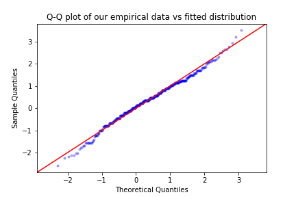
We can see both from the P-P and the Q-Q plot that our model fits quite well, as there are no extreme deviations of the points from the diagonal of each plot.
Final comments
In this entry we have seen how to estimate parameters of a GEV using empirical data, with the method of maximum likelihood. While this works for a generality of situations, there are some problems with numerical stability that can be avoided using other methods. For now, we will trust that scipy is doing its best to find good candidates for our parameters. It is also worth mentioning that there are also different methods to assess goodness of fit in this context, and particularly relevant are the return level plots. We will not go into the details of such tool in this entry but possibly in the next ones. It is also important to remark that the asymptotic models that we have discussed in these three entries are not the only models in ETV and in most ocassions, they are not the most useful, as they do not make use of the whole time series but just the maxima over a fixed period of time. In future series we will introduce threshold methods that do make use of such information and are able to yield stronger results. Finally, it is also worth mentioning that in future entries we will address the issue of predicting using EVT, although with what we have already seen it is more than possible to make some basic predictions.
One last thing to mention: this entry was inspired by the work of my ex-colleagues Meagan Carney from Max Planck Institute, and Matthew Nicol and Robert Azencott from the University of Houston.
Leave a Comment